API Documentation Using Tables
It’s well known that APIs need developer-friendly docs in order to gain widespread adoption. However, little if any improvement in the REST API visualization methods have been made over the past few years.
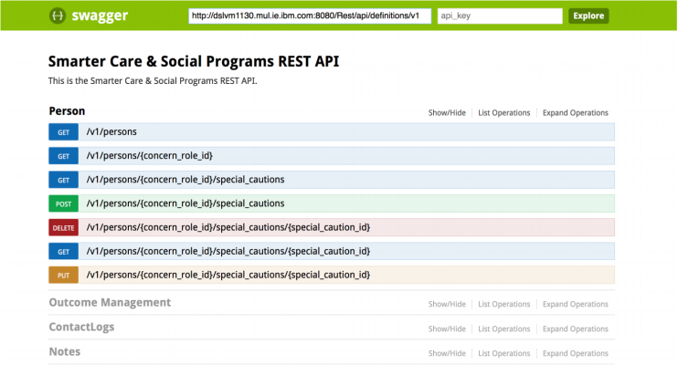
Nowadays, most API docs and developer portals adopt a Swagger UI type of format where all the endpoints in the specification are simply listed, one after another within categories.
This format does a good job of communicating the low-level details of each endpoint; However, when dealing with increased API complexity, developers need a way to get a high level understanding of the API before diving down into those low-level details.

Existing API Visualization Methods
The image above depicts Swagger UI documentation for a sample API. As an API specification grows in complexity, I find it increasingly difficult to answer the following questions using the aforementioned format:
-
What are all the resources that this API exposes?
-
What operations are available on key resources?
It’s easy to see why these problems exist. Even with tags, an API specification with many endpoints will take a long time to navigate. On top of this, Swagger UI will list the same endpoint multiple times for each action (GET, POST, etc..) that is available at that endpoint, resulting in a large amount of duplicated text. As a result, determining basic information about an API such as what resources are available can be a difficult task.
When first examining an API, developers need a high level representation of the specification that conveys the essential functionality of the specification.
API Tables
API Tables form the perfect solution for providing a quick overview of a group of related endpoints in a specification. The image below represents an API Table for working with Pull Requests in the GitHub API. The table is read left to right, where each cell builds on the cells to its left to represent a certain endpoint of the API spec. Each table cell also has buttons representing operations available at that particular endpoint (GET, POST, etc..) that users can click on to view more detailed documentation, go ahead and try it out below!
|
repos |
{:owner} |
{:repo} |
pulls |
{:number} |
commits |
||
|
files |
|||||||
|
merge |
|||||||
|
comments |
{:id} |
reactions |
|||||
|
reviews |
{:id} |
comments |
|||||
|
events |
|||||||
|
dismissals |
|||||||
|
requested_reviewers |
|||||||
Compact
A quick glance at the table above conveys what resources are offered by this API along with what executable operations are available on those resources.
The API Table above compactly depicts over 30 different API operations whose documentation spreads across six different and lengthy pages on GitHub.
And this is precisely why API tables are incredibly useful, they provide a high level representation of an API that allows developers to explore low level documentation in a natural and intuitive way.
Ideally, developers wishing to explore an API would start off with API Table representations of the API. Next, they would use the action verb hyperlinks in each cell to further navigate to low level documentation as done for the GitHub API above.
Easy to Read
These tables are also very easy to read. They consist of very little text in comparison to other documentation methods and most people prefer reading horizontally oriented tables over vertically oriented lists of text.
Most importantly, API Tables can represent larger and more sophisticated API specs without sacrificing readability. For example, the sample table depicted above can easily accommodate displaying up to 65 different operations!
Closing
I strongly feel that API Tables supplement the existing Swagger UI very well. Swagger UI does a great job of displaying low level details, while API Tables are the perfect entrypoint for developers wishing to get a high level overview of an API.
Do you think API tables can be useful for API documentation in combination with Swagger-Type specifications? Let me know what your your thoughts are below!
